After completing my research for this project, I started working in my sketchbook. I started how I always do now, with a mind map and a mood board. I tried to think of things relating to magazine illustration, but I also took each of the prompts from the brief and starting mind mapping those as well. I wanted to see what ideas I could form from them.

Something that really struck a chord with me was the disaster prompt. When I looked up ‘types of disaster’ on google it said that disease and epidemic was a type of disaster. Obviously living in 2020 is all about pandemic, disease and trying to prevent disaster. I was so inspired by this – but I think that only makes sense, every aspect of our lives is currently effected by covid-19 and the need to control the virus so that we do actually prevent disaster.
My illustration was doing to be based on just that – ‘Can We Prevent Disaster?’. It sounds like an article about preventing disaster by the pandemic getting even worse, or by the country not managing to control the virus and result in disaster for the NHS.
I made notes in my sketch book, all things that came to mind when we talk about corona virus and lockdown. What were visuals that prompted thought on covid-19 and lockdown etc?
Face masks, Gloves, Visors, Key Worker papers, leaflets explaining lockdown, children’s paintings of rainbows.


Next I got together some items to photograph ready for my still life. I used hand soap, face masks, gloves and hand sanitiser. I photographed them in a few different compositions. I sketched the best ones in my book, I tried to think about how they would translate in a magazine illustration. Is it clear enough to understand? Does it make sense in context with the article.


I was most happy with the illustration without the gloves. I didn’t think they gloves were clear enough, where as the other items were all instantly recognisable. I chose this one to use for my still life drawings. I worked in pencil for my still life.


When I look back over the drawing now I can see some areas I am unhappy with, the hand sanitiser bottle was not as accurate as I would have liked. I felt very rusty working on this still life in all honesty – I feel like I did a lot more of these types of drawing on the Drawing Skills module, and I had really got to grips with a still life. It has been quite a while since I did that now however and I should really start doing more still life drawings in my personal work to keep exercising that muscle!

I made the tonal study in procreate. I started making each different element of the picture individually – this was a really interesting way of working for me. It was almost like a jigsaw puzzle or a collage – putting the different pieces together. I feel like this was really helpful for me as it did break the habit I have of relying on line. Instead of using opaque/block tones of colour drew them with a watercolour brush. I wanted the image to appear more stylised and modern – especially after the research I did into magazine illustration. I wanted to push myself a little. I do think it paid off because I am really happy with the way this turned out. I feel like the briefs in part 4 did really push me out of my comfort zone and that it forced me to be more experimental. I hope that if I keep working in this way on my OCA journey that I will develop my own style.


After the tonal exercise I started working on some more experiments with different brushes. I did keep the same monotone theme as I think it was really effective in the previous drawing. This time I did use ‘ink-ier’ brushes but the pieces do look more digital because of the block colour, I think they appear a lot more flat than my tonal study because it mimics traditional media. I decided for my final piece I wanted to merge the ideas from both, I wanted to use the tonal study and add more details/refinement.


I liked the grey areas of the other studies that gave the illusion of the surface that the objects were sat on. In the final piece I wanted to do this again but more refined. I also wanted to add more texture. I experimented with some brushes in Procreate and found some more watercolour brushes and pastel style brushes I liked and thought fit in well. I also decided to keep the piece monotone – as this was an article about disaster and now covid-19 it was to be assumed that it was a magazine for adults.
I actually decided to continue using the same image that I created for the tonal study and elaborate on it. Otherwise I would have been spending a lot of time trying to replicate the image – I just duplicated the file and worked within that.


I added the surface using different layers of pastel brushes and added shadows to the objects. I feel like this helped create more dimension. I tried to work with a midtone and then add areas of shadow and highlight. I added some detail and further texture. You can see on the actual objects themselves I added further shading and detail to make them seem more 3 dimensional. I also added more area of highlight to make it look like the light was shining on them, in an almost spotlight way.


I kept the background white, I felt the composition was effective for a magazine illustration as there was space for titles and text around the illustration. I also felt that the illustration was minimal enough to be able to be used at a larger or smaller scale.

This project was a big step for me, I never usually work in this stylised way, especially with using minimal line. It feels more graphical than my usual work and I think this helps it feel more refined. I do think that there is almost a mid-century aspect to the final piece and I am really happy with that. I do think that the initial drawing could have been more accurate and that perhaps I could have taken more time on the actual graphic design aspect to the drawing again – start adding text to the initial thumbnails etc so I can better see how to place it.

I wanted to make these mock ups so I could show how the illustration would work in a magazine.

Image Source for Free to use Magazine Mock Up
I showed the illustration as both the large and small illustration in this magazine mock up (which I downloaded from the link above). I wanted to show how it would work a long side an article in a magazine.
As I said earlier in part 4, as I progress through the course I can definitely see that I do have a big weakness on the graphic design front and that it is something I definitely need to improve upon. Something that has improved in my work on part 4 however is my use of line. I no longer feel like I am relying on it as much, especially in this piece where I have used small areas of textured line to add detail. I think my use of line has changed, it is much more loose – I do still have a long way to go but I do feel like I have been trying to implement my tutors feedback into my work as much as possible and it is paying off. I look forward to continuing to part 5, but I will definitely be revisiting part 3 will some of the things I have learnt and my tutors comments to improve the section before any formal assessment.


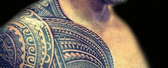 Samoan Tattoo –


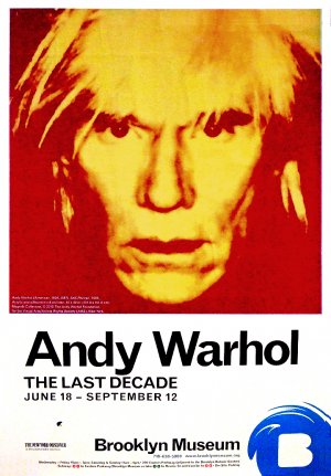 Poster for ‘Andy Warhol – The Last Decade’ for the Brooklyn Museum


 Quentin Blake –