To get started on this project I did some research into poster design for both museums and exhibitions.
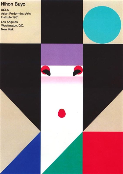
Nihon Buyo UCLA Poster – Ikko Tanaka – Image Source
What I see when I look through all these designs is that no matter what they are for or who they are for they are all very attention grabbing and all very clear to understand. They are often quite graphical in style, and use large areas of block colour to draw the eye. The text is usually very clear to read and understand – to easily communicate/advertise the exhibiton/gallery/museum. The above image by Ikko Tanaka is very eye catching – large blocks of colour – you initially see and image of a face but when you look close it is all made from shapes. I found this interesting article on Japanese Poster design . A lot of these posters have very clean but very clever design, I would like to look further in to Japanese design in the future.
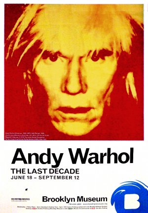 Poster for ‘Andy Warhol – The Last Decade’ for the Brooklyn Museum
Image Source
This poster for an Andy Warhol exhibition is very clever, it has a famous photograph of the artist a long side his name in large clear letters – it is instantly recognizabe. You could see this poster from across a room or even a train station and instantly know who it was and what it was for. Again – the bold colours are not only typical of Warhol – but they instantly draw the eye.

Design Museum Poster – Richard Hogg – Image Source
This poster by Richard Hogg is very clever as well – It is for a family day at the Design Museum. It is definitely family friendly and features lots of fun characters to really draw younger viewers in. Older viewers can appreciate the design, and everyone is drawn in by those bright colours.
Here is a link to a Pinterest Board with further research/examples of Museum Poster illustration/design – I enjoyed looking into poster design and I think that poster design is an art form in its own right.
Unfortunately going into this project I was unable to go and visit a museum in ‘real life’ as everything is still closed at the moment due to Covid-19. What a very strange time we are in. I instead did the very best I could do from my house and I went online, looking up different museums, different types of museums and viewing virtual exhibitions that were being offered online via museum websites. I also looked up different museums on trip advisor and social media, looking at both what was on display and what visitors had to say. This was so surreal – I felt like I was longing for something from another era when in reality it was just a couple of months ago that we could go and browse in museums and stand next to other visitors whilst viewing collections/exhibitions!

I did some research on museum posters and each audience as a target market. I made some mind maps about what appeals to each group based off my research. After this I decided I was either going to make a poster for children or teenagers – it was going to force me to think in a different way. Adults know what they are signing up for, they see what is on, and they go – as the museum/exhibition already appeals to them. Children and teenagers however usually visit with school or go along with parents – what could I create that would actually grab a younger persons attention and make them actually want to go to the museum.


I was finding it difficult to choose which museum to create a poster for but when I was looking at museums online – I saw a ticket that was for sale so that you could visit the Natural History Museum and the Science Museum in one day. I was looking at all of things available to both museums when I started sketching different ideas and characters based on the themes from each museum. I did a page of ideas for children, and one for teenagers.

I liked coming up with ideas for both. Making something for children definitely allows more creative freedom but creating for teenagers really pushed me out of my comfort zone. When I was researching museum posters for teenagers I couldn’t find a great deal of things – when I created my mind map I was thinking that humour is often responded to well and is shared online. That made me think about ‘memes’ – viral images that are shared online between friends, often teenagers.
Here is the dictionary definition for Meme – from the Oxford Dictionary via Lexico – https://www.lexico.com/en/definition/meme
-
1.an element of a culture or system of behaviour passed from one individual to another by imitation or other non-genetic means.
-
2.an image, video, piece of text, etc., typically humorous in nature, that is copied and spread rapidly by Internet users, often with slight variations.
Lexico Dictionaries | English. 2020. Meme | Definition Of Meme By Oxford Dictionary On Lexico.Com Also Meaning Of Meme. [online] Available at: <https://www.lexico.com/en/definition/meme> [Accessed 4 July 2020].


Above are some examples of ‘memes’ – they typically include a bold white font with a black outline – the typically used is impact but as you can see from the above examples that can differ. A lot of memes typically have a block colour background – often resembling a simplified starburst pattern. When I was sketching and coming up with ideas for the teenager poster I couldn’t get the idea of the ‘deal with it’ meme out of my head – it is funny and has just the right amount of teenage attitude. The meme format usually features a pair of pixel sunglasses on someones face and the words ‘deal with it’.


I had drawn a character of a robot for the science museum and explored this for both children and teenagers. He could be cuter and part of a family for the children’s poster – which also appeals to parents. He could be funnier and more sarcastic for the teenagers poster.
I drew some dinosaur characters too – inspired by the natural history museum. I think that the dinosaur is something that is so instantly recognisable as part of the natural history museum so why not play with that and let the dinosaurs become their own characters?
I drew up two mock ups for posters after exploring these ideas – I redrew my ‘deal with it’ dinosaur larger, and I drew up the robot family. When I was drawing these up I decided that the dinosaur poster should have a line about ‘discovering’ something – teenagers are very sure of themselves and especially at the ages of 13-16 they want to do things for themselves. After having their attention drawn by the initial meme/joke – something about discovering for themselves might hold their attention afterwards.

I decided to go with this idea for my finished poster. I know that this probably wasn’t the most efficient way to work for this project but when I couldn’t visit an actual museum it made it a little harder to choose. The text for the meme I decided on was ‘Evolution Happened – Deal With It’. It is attention grabbing and has attitude. I think it is also political enough to really grab a teenagers attention.


I initially made a water colour illustration of the dinosaur but when I put it into the digital file to create the ‘meme’ part of the poster it didn’t look quite right – I ended up redrawing him digitally.


I think this illustration better suits the target audience too, I think the watercolour version did look better suited to children. I drew the sunglasses to look more recognisable as the pixel style glasses from the meme format.

Image Source for Natural History Museum Logo
Overall I am happy with the finished out come of this project – I would love to revisit this when I can actually step foot inside a museum and develop ideas based off my own photographs and sketches I could take when I was there. I would also like to revisit the little robot character I drew in this section – I think he is really cute and funny in the initial sketches I made.
