When starting on this exercise and researching different illustrators I ended up watching videos on YouTube both interviewing the illustrators and watching them work. I found it really helpful to not only know how they work but see exactly how they draw and hear them talk about it themselves. I ended up down a rabbit hole of watching mainly children’s book illustrators and watching them work. I found it really helpful – it is not often we get to actually see these illustrations being made!
Quentin Blake
 Quentin Blake – image source
Quentin Blake’s figures are drawn in a very energetic and sketchy way. I almost don’t know how to explain Blake’s line work and this is exactly the reason I decided to look at his work in this exercise. They are dynamic and don’t feel like just an outline – they give the energy and sense of movement and excitement to each piece.
The characters tend to have quite big expressive faces – you can instantly understand the emotions of the characters and therefore the atmosphere of the scene – I think that is one of the many reasons his work is so popular with both adults and children.
Elements of the figures are distorted in the fact that they are not accurate – nor are they meant to be. When you focus in on areas of the drawings – particularly the hands of the figures you can see that they are not ‘correct’ – but they are expressive. The shapes and sketchy lines indicate movement and create recognisable shapes. Quentin Blake’s work is not meant to be ‘accurate’. It is supposed to be fun, dynamic and eye catching. I think there is almost an element of naivety in Quentin Blake’s work which is very clever – particularly in children’s book illustrations. It is immediately relatable to children and gives adults a feeling of nostalgia.

Self Portrait – Quentin Blake – Image Source
Blake’s work is usually very colourful which really adds to the ‘fun’ feeling of the image as well as immediately drawing your eye in. The texture in the piece is mainly the watercolour paint – it appears to have been used almost as loosely as the lines. There are areas where it has been allowed to pool when wet and go out of the lines, I think this helps add to the dynamic feeling of his illustrations.
I have a lot to learn from those sketchy dynamic expressive lines and how they indicate motion. In my own work in the process from initial sketch to finish piece I clean up the line work so much to the point that it doesn’t have any of the energy left of the original sketch – the finished piece often seems so cold. I want to be able to replicate the spontaneity of the initial sketch with in the finished piece – Quentin Blake’s work feels so fun and spontaneous – I really should start allowing myself more room for expression within my work.

A Kiss For The Cat – Quentin Blake – Image Source
I chose to look closer at the illustration from Roald Dahl’s Charlie and the Chocolate Factory. I can remember reading this book as a child and seeing the illustrations. The whole thing was so exciting to me, everything seemed so fun and so plausible. The illustrations are instantly recognisable and now as an adult I miss that sense of naivety, believing that one day an eccentric man in a top hat would give me a chocolate factory! I honestly believe it wouldn’t have been the same with anyone else’s illustrations.
I made some notes whilst looking at the composition of this piece – the figures are both central and joined by holding/shaking hands. Charlie holds the golden ticket above his head which is level with Willy Wonka’s top hat – at first glance this makes them appear around the same size despite one being a child and one being an adult. I think this is very clever as it makes the child look just as important as the adult – as though they are on the same level. The floor is indicated by the colourful chocolate boxes at the bottom of the image behind the figures, again something eye catching and very exciting for children.
Judith Kerr
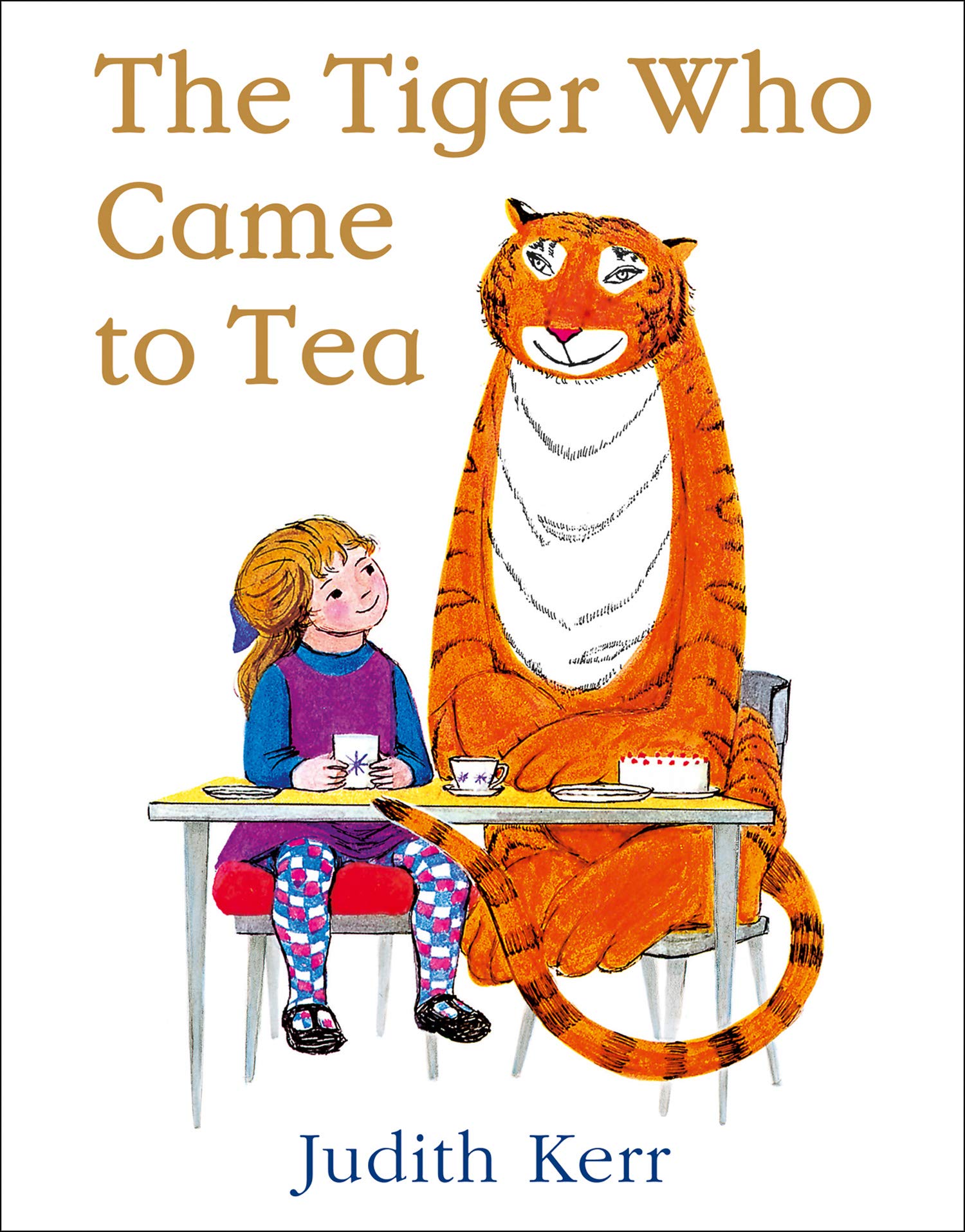
The Tiger Who Came To Tea – Judith Kerr – image source
Judith Kerr’s work is instantly recognisable to generations of people at this point. Her work is very distinctive. Faces are very expressive particularly on the cats faces (mog and the tiger for example). They have big smiles that really give a sense of mischief. Looking at the cover of The Tiger Who Came To Tea the composition has the girl looking up at the tiger with a look of wonderment on her face – I think that all children who read the book feel the same way about the tiger – he is a brilliant character that kids love. I think for adults looking back on the book now they are more focused on the family and the little girl.
They are both sat at the table with cups of tea and a cake.
The colours are bright and very saturated, this adds to that sense of fun that the book really brings across. I think with a different palette it wouldn’t seem as fun – I think that the bright colours are really attention grabbing and help keep children engaged. I really like the sketchy lines that she uses on the characters – I think that this really does create a sense of energy.

Mog – Judith Kerr – Image Source
I think this works really well for the image and the entire book because you feel instantly drawn in right from the front cover. I am a huge fan of Judith Kerr’s. There is just something about both of the illustrators I looked at in detail in this exercise that evoke the same feeling of fun, energy and movement – that really help both grab and keep kids attention. The more I learn about illustration the more I develop such a respect for what people manage to achieve. These illustrators provoke emotional reaction in both children and adults, their illustrations are a part of so many peoples happy memories.
I mainly focused on Quentin Blake’s illustration style for this exercise. I really wanted to try that looser style of drawing, I thought it would be a great way to try and create a sense of spontaneity within my own work. When choosing to go back and redraw the work from a previous exercise I chose the 1950’s project. I think the thing that let me down in that project was that the figures seemed so still and stiff. I thought redrawing them in the same medium/and trying to mimic the style of Quentin Blake was a great way to try and loosen them up a little.
In the video I watched about Quentin Blake he said he did a little bit of prep work as an initial sketch but not too much that the work wouldn’t seem spontaneous. He would then place another piece of paper over the top and then quickly sketch on top. I tried to mimic this, I made some watercolour work and also some with pen. I also tried to mimic the faces of the characters as they are so expressive!


This was a really interesting way to work, it was definitely thought provoking as it forced me to work in ways I never have before. I think my finished drawings are a lot looser and more energetic than the original drawings so I am happy with that however they certainly aren’t as refined as Sir Quentin Blake’s!
