I started this project with some research into visual distortion in illustration . What I found was that through distortion you can change the atmosphere of an illustration. Through the next few examples I really found how you can play on warping a familiar image and how that changes perspective.
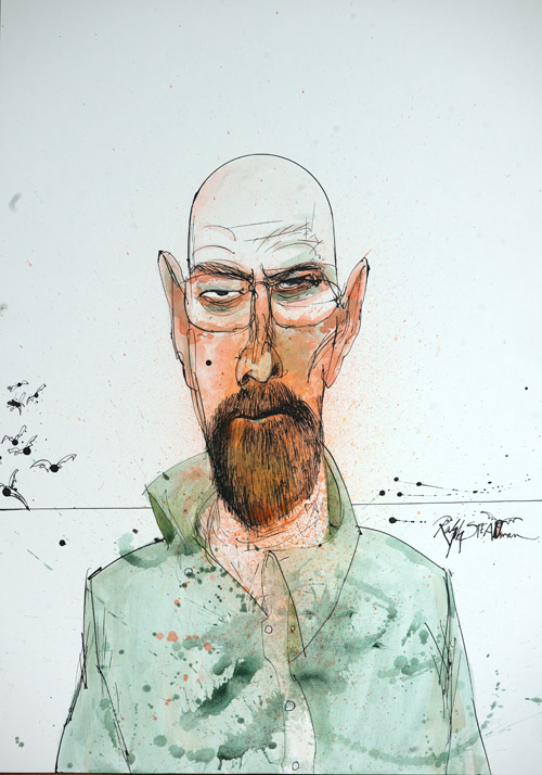
Heisenberg/Breaking Bad – Ralph Steadman – Image Source
Ralph Steadman creates surreal images by playing with distortion. A lot of his subject matters are recognisable but the change in scale is what gives them that surreal feeling. The bodies are elongated and the heads are over sized. The proportions and the loose lines give his work quite a creepy feeling.


Batman; The Dark Knight Returns – Frank Miller
I looked into some comic books as part of my research – I know that it is a common tactic in comic books to distort faces to create an element of horror and to make the viewer uncomfortable. My husband is a comic book collector so I asked for some recommendations – I also asked if he had something by Frank Miller after my tutors recommendation! I have selected some batman comics to look at as the Joker is often depicted in a distorted way – again I believe this is to create a sense of terror and make the viewer uncomfortable.


Batman Secrets – Sam Kieth
You can see in both of these examples the two different ways this has been done. Both have similarities but both have differences too. Both of them have a large creepy mouth – creating that surreal quality. The Sam Kieth one goes further however and the faces are completely warped – elongated and the scale changes between each panel. I think it is brilliantly done, it totally communicates that feeling of terror – and just how scary the character is.
For this exercise I decided to draw a cat. I have never really drawn cats before and I thought a cat would be a particularly interesting subject matter for ‘visual distortion’. I also wanted to see if I would be able to portray the soft/flexible way a cat’s body is/moves through drawing and collage, I thought it would be interesting to see if I could achieve it and how it would alter through the various states of the drawing.

I found a reference image online and made some initial sketches in my book. I wanted to practice drawing the cat before starting on the larger drawing. Again, I wanted to see if I could achieve that feline form via my work. Once I was happy I started on my pencil drawing of the cat – I worked on A4. I am happy with the drawing and I do feel like I managed to portray the feline form however now I am looking back over the drawing I do feel that as I spent so much time trying to get the body right that the face is not as good.

This is the 5 line drawing I made of the cat. When I originally read the brief I wasn’t sure how I was going to achieve this but I am actually very happy with the result. I think it clearly communicates an image of a cat and also retains that feeling of movement.

Before I started working on the collage I started collecting cuttings from fashion and photography magazines. I chose everything that looked interesting, textured or abstract. I also made an outline sketch of the shape of the cat so I could see what space I was working in.


I didn’t plan where and how I placed each piece of the collage – I just chose what I thought was interesting. I’m glad I did this at it definitely made it more thought provoking in the next stage when I started on the final piece of this section. I ended up with a very colourful, patterned cat with two very big blue eyes. After making the collage I decided to come back to it the next day with fresh eyes. I wanted to see what thoughts it prompted on its own.

When I came back to it, I started working on my sketch, drawing the cat again with big blue eyes and lots of patterns. I started thinking about patchwork and fabrics – that got me thinking about colour blocking and pattern blocking.


A long with the big blue eyes I started thinking about how this could have been the cat of an artist or a fashion designer. Each section could be fabric stitched together, or even painted canvas.


I decided to go with the fashion cat. With the eyes it just seemed to make sense. I imagined that she was the cat of someone who was a fashion designer. The owner would design her clothes to match her super colourful cat. After I had finished the drawing of the cat I started working on the rest of the drawing, I started sketching out the dressing room of the cat’s owner. She loves bright colours and prints so I added art prints that matched the patterns on the cat. The dress and shoes that are in the room also match the cat.


The end result is actually quite surreal I think as I don’t know if it actually makes sense. That being said I feel like the story sort of wrote its self – once I had drawn the patterned cat the narrative just seemed to flow a long with it.

I found the exercise really interesting because of this. It is something I would like to experiment with more in future. If I was to do something like this again I would maybe experiment more with texture and shape. That being said I am happy with the overall outcome – this is something I would never have drawn or even thought of. I did also enjoy working with this colour palette – again I never usually use colours like this but I feel like it was predetermined by the collage. Now I have built my confidence I would like to revisit this type of exercise – I would like to push the distortion aspect further, maybe play with faces to create something a little more surreal and maybe uncomfortable – like the examples I found in my research.
