Using Black and White

I chose the word extraordinary for this exercise. I was trying to choose a prompt to push me out of my comfort zone and this one certainly did. I started by looking up the definition of extraordinary and synonyms for the word to help me get a better understanding.

This led me to the idea of of a super hero. They are characters that are usually human but possess powers, therefore fitting the definition.

I started by looking through some of my husbands comic books for idea, I looked through a variety of different ones but I did found I liked the style of the older 1980’s comics I was looking through. All these characters are extraordinary in their own ways, some of them have superhuman powers and all of them put themselves at risk to help others.

I moved into working in my sketchbook, I looked online for superheroes and was trying to find away I could fit this into the brief in a successful way. I ended up looking over photographs of batman and the bat signal – which is a large light projected into the sky to let batman know he is needed. I thought this was interesting and could create a successful image for this exercise due to the contrasts between the light and dark.

I made some sketches exploring different ideas for how I could interpret this idea. I ended up deciding on a city view with a beam of light and the silhouette of a superhero in the light. I added two rows of buildings to try and give the illustration a little more perspective. After making these images I made a final line drawing.

I used a Studio Pen in procreate for the final sketch and then inverted the image so I had both a black and white copy. I planned to keep all the windows white as well as the beam of light. In the beam I wanted to add some black lines by using the cut out from the black sheet.

I printed both of these out in a3, the print job wasn’t quite even on the black sheet but the printer tried it’s best! I started cutting out the black sheet to layer on the white sheet. To be honest I was a little dubious at first, I had an idea in my head but wasn’t sure how it would play out. I was pleasantly surprised however with how the image was coming together! The contrasting areas of light and dark did bring some dimension to what was previously a very flat image.

Even though I chose extraordinary as my word I did end up drawing buildings as well, but it made sense for the image.

When I was placing the black layer on top of the white I initally went to glue the windows right over on another so they would sit the same on each layer – I realised however that if I moved them to a slight angle the line art underneath would show through and create a three dimensional effect! I was really happy with this effect and I added it to the rest of the image – I know that the brief says to not let any line art show and maybe I experimented a little too much here.

I am happy with the overall effect however now when I look back over it I wish I had cut out some star shapes from the black sky before sticking it down. I think that it would have been really effective and added a little more atmosphere. If I were to do it again I would definitely use a cutting board and a paper cutting knife! I used scissors for this and it was very difficult to be accurate.

When comparing the finished image with the original line drawing there is a very large difference. The original image is flat and the contrasting layers definitely creates a lot more dimension.

When looking at illustrators who work in a graphic style I came across the work of Charley Harper.

Charley Harper (1922-2007) –Image Source

Charley Harper’s work is very graphic in style – no outlines and block colour. After completing the using black and white exercise when I look at his work I can almost piece it together in the same way. His images are very stylised but still very beautiful. He used bold colours and high contrast to create the animals often featured in his work.

Image result for Charley Harper

Charley Harper (1922-2007) – Image Source

Harper referred to his work as ‘minimal realism’ which I think is very fitting, the creatures seem almost abstract but they are still instantly recognisable. I wonder if this is because we all find these animals recognisable already so it gave him room to explore shapes and colours whilst still creating an image that a large audience could enjoy. There is so much to learn from looking at his paintings – they are complex but still have an element of simplicity.

A Subjective Drawing

For this exercise I chose the word umbrella. I don’t know what drew me to this, but I don’t know if I’ve ever drawn an umbrella before! I was looking forward to experimenting with this exercise. I made a list of features that I could think of when it came to an umbrella.

I chose ‘textured’ as the word to focus on. I went through magazines and found anything that had textures that related to an umbrella, whether that be something that relates to the actual texture of an umbrella (plastic-y, scratchy, shiny, folded) . I also included ones that related to water and being wet, when water is on an umbrella the waterproof fabric makes the water run straight off and form droplets.

As well as collecting magazine pages that depict textures similar to that of an umbrella, I also started experimenting with different textures similar to that of an umbrella – I used some recycled plastic packaging, a carrier bag, and I manipulated some kitchen foil to create texture. This played on both the texture theme as well as shiny. I then photocopied all of these things, I scrunched up the different materials and photocopied them. I used both the photocopies and the magazine pages to make a collage of an umbrella.

I enjoyed doing this and working with my hands to create an image with shapes. It was like a puzzle figuring out how all the pieces went together – also making an image from collage was quite fun! It reminded me of being a child and unafraid of experimenting with creativity.

After making the collage I made several photocopies of it again – I tried colour and black and white. The white background of the scanner washed out the collage so I experimented within my sketchbook of layering the umbrella on some more of the textures I had created. I thought the image seemed lost among all the texture and it definitely needed a solid background to contrast. I ended up trying a large envelope to create a contrasting background but still give it that collage feeling. I like the way it turned out!

After making this image I made another copy and lined it as a drawing using black and white pens. I also added some rain drops using some more of the photocopied foil – I then lined these as well.

I like the result of both of these finished pieces – working with collage and drawing is very similar to how I work on my ipad – working in layers and building the image from the base up. My final piece did end up different than my initial line drawing because when I was experimenting I realised that there needed to be an extra section in the umbrella to give it a clear shape. At first I was worried about this but I realised it was a good thing – working in this way gave me the freedom to change what I was doing even though I was so far along. If I had been painting or shading this, the line art would have been underneath and I wouldn’t have realised later. I do enjoy the freedom this exercise allowed but if I were to do it again I would like the end result to be more refined.

Artist Research

I wanted to spend some time looking over some of the suggested reading/viewing sent to me by my tutor. I plan on doing a few posts like this where I look at a couple of the suggestions in each one.

Sara Fanelli

Image result for sara fanelli

‘Dear Diary’ – Illustration by Sara Fanelli – Image Source

Sara Fanelli is an illustrator who paints and uses a lot of collage. The use of collage creates very interesting images that definitley hold your attention, often there is a lot going on – not just in subject but also aesthetic. All of the different elements of the characters are different prints and patterns – I feel like the longer you look the more you see. I feel like the collage and the expressive characters merge together to create a real sense of playfulness and whimsy.

Image result for sara fanelli

Mythological Monsters – Sara Fanelli – Image Source

Something I really love in Fanelli’s work is her hand lettering – I think it really adds to the feel of the piece. I would definitely like to explore hand letting and experiment with using it in my own work.

Laura Carlin

Image

Illustration by Laura Carlin – Image Source

Laura Carlin is an Illustrator and Ceramicist based in London. I hadn’t come across her work before my tutor suggested I look it up and I really like it. I love the areas where you can see the brushstrokes and the lines of pencil, it gives her work such an organic feel without being forced.

Tiles by Laura Carlin – Image Source

I feel like her work has such a sense of freedom to it and the characters and the landscapes all feel so dynamic and intriguing. You really do find yourself wanting to know more.

Nina Cosford

Image result for nina cosford

Illustration by Nina Cosford – Image Source

An illustrator who I wanted to mention whilst I was on this train of thought was Nina Cosford. I am a big fan of her work and backed her book ‘The Trans-Siberian Railway’ on Kickstarter. The reason I wanted to mention her work is because she is another illustrator that uses traditional media and allows the texture of the material to show through. I really admire her use of pencil crayon in particularly – she always achieves such a vibrant image by layering and applying different pressures with pencils. I don’t know why but I am always quite anxious to work like this, I don’t know why – I think it stems from my school days and being told ‘how’ I should draw.

Photographs from my personal copy of ‘The Trans-Siberian Railway’ by Nina Cosford
Book can be found here.

I feel hyper aware that a lot of my work feels quite stiff and this is something I would really like to tackle, I think moving on to part 3 I will definitely be working traditionally a lot more. I think digital is tempting but it feels very easy to over work something and I definitely lose the freedom of the initial sketch under the final line work. I want to experiment more working with my hands and also incorporate more areas of collage and mark making. I think that these are only skills I will learn by using my own two hands – I love using my iPad and it definitely helps me with time management as it is a lot quicker to work that way but there definitely needs to be more of a balance. I feel that when I made those initial sketches and thumbnails in my book I do lose some of that energy within the final drawing. I enjoy working in my sketchbook especially now I feel like I have more tools to help me develop ideas but it does feel like there is a barrier between the book and the screen and I would really like my work to feel as organic and energetic as the artists I have looked at today.

An Objective Drawing

For this exercise I decided on the word shoe. I decided to draw a high heel shoe – I thought it had a lot of interesting shapes compared to my flatter shoes. I made these initial sketches in my sketchbook until I got a shape I was happy with (drawing on far right) – I thought his one I had finally got the proportions right.

I moved on to the final drawing and I drew the heel. I used pencils, eraser and a paper stump to create the image – my paper didn’t hold the pencil very well and although this made it quite easy to blend it made it hard to build upon. I am happy with the drawing overall, I am happy with the use of pencil but when I look back at the drawing now I think using more contrast could have been more effective in the final drawing. I think more contrast between the light and dark would help create more dimension in the image.

When I had finished the drawing I wanted to experiment a little and decided to photocopy the drawing. The photographs below are what came out. I think this is really interesting because it does exaggerate those areas of light and dark and where you can’t see line it gives more of a suggestion of the form rather than the typical outline. I do actually quite like the effect of the photocopy.

One one of the photocopies I decided to use fineliner to outline and let the copy ‘be’ the shading. I like the way this image turned out – this has given me some ideas going forward how I could use collage in my work. The collage and experimentation doesn’t have to be the main feature of a drawing – this is proven here where I have created a more ‘realistic’ drawing but still been able to play with it.

Exploring Drawing and Painting

I started collecting various materials to use for this exercise. I made a small sketchbook with various collaged papers and masking tape. I used recycled packaging paper, magazine pages, tissue paper, watercolour paper and envelopes for the pages. I layered some of the papers as I wanted to see how the same media reacted differently to different surfaces.

I drew a cup cake for these experiments. I didn’t draw the cakes exactly the same for each of these drawings and i’m glad I didn’t as it allowed me to experiment further – the simpler style ones allowed me to experiment with dry brushing and palette knives, where as the pen drawings allowed for smaller lines and finer shading.

Top Row;
Photograph of Sketchbook closed.
Next is dry brushed acrylic and acrylic gesso on magazine paper and masking tape.
I think using white acrylic and a smaller brush would have been more effective for this. I don’t think the gesso was layered up enough to be effective.
Next is pencil crayon and pen on the inside of an envelope and pink tissue paper.
Shading on tissue paper was very hard but was surprised that I was actually able to layer the pencils successfully.

Second Row;
Photo of first two drawings in book.
Biro drawing on envelope and tissue paper.
This is my favourite of all the experiments, I chose to use a biro as the brief said to include the ‘cheap and throwaway’. I loved how easy it was to draw with – I don’t think I have drawn with a biro since I was in secondary school! It drew on the envelope very easily as expected but it was very hard on the tissue – it actually tore at one point and I was being very gentle at that. I would definitely like to use biro more in my work.

Third Row;
A digital drawing using typical digital shading techniques collaged on packaging paper, floral tissue paper and pink tissue paper.
I decided to add a digital drawing because I wanted to see the juxtaposition of it with the found materials. I love working digitally but I still want to be able to explore ideas physically. That is why I print out my digital sketches and pieces and use them in my sketchbook.

Next is a photograph of the sketchbook spread with biro and pencil experiments next to eachother.

Fourth Row; Close up on previous drawing, fineliner on watercolour paper and background shaded with pencil crayon.
I quite like the texture given by the pencils on the watercolour paper however it is hard to blend.
Felt tip on the back of watercolour paper, smudged with water.
This is one of the most successful experiments, I would never have thought of using felt tips in my illustration but I liked the way they smudge and blend. They managed to retain any vibrancy.

Next is fineliner on packaging paper.
The pen bled into the paper and the lines lost sharpness.

Using Reference

To start collecting reference for this project I started a pinterest board to start a digital pin board. It does feel like a digital mood board and I did find it very handy in this project. Please click the image below for a direct link to my pinterest board for this project. I pinned photographs of people and homes as well as illustrations and adverts from the time.


pincode_583286657928179849

As well as using pinterest and google I also found the following websites very handy, particularly the Historic UK site. This website has multiple links regarding all different topics/aspects of life in the 1950’s.

Website addresses;
Historic UK – 1950s
National Archives
History Today

I also used this project as an excuse to rewatch some of my favourite 1950’s movies and television shows. I rewatched ‘Some Like It Hot’ (1959)  and I also rewatched some episodes of ‘I Love Lucy’ (1951-1957). Both are American productions and I did try to stick to UK references for this project but I Love Lucy was groundbreaking and is considered the greatest TV Show of all time. Some Like it Hot also still stands up today and is considered one of the greatest movies of all time.

This is London Reel 1 (1950) – Youtube
London Girls (1954) – British Pathe – Youtube
Blackpool Holiday (1957) – Youtube

I also watched the above videos so that I would be able to reference the era better – to get a feel for how the landscape looked, how people dress and act. I am a vintage/history lover and the 1950’s is my favourite era of design and fashion, so I have to say that I really loved being to indulge in this material. The people are all so well dressed compared to today and with no personal technology people are all out and about and conversing with one another. I found the video of Blackpool one of mixed emotion. It is filmed so well, it is truly a candid look at holiday makers of the time, and again I love the way people are dressed. However I used to live in Blackpool and recently visited and seeing how downhill it has gone is very sad. In this video it is a real resort, everyone is dressed up and having a great time and I recognised so many of the places in the video.

I made a mind-map and mood-board in my sketchbook thinking about what I had seen in the videos and on the websites. I wanted to make sure that I didn’t gloss over the political climate of the 1950’s. I think it is very easy to idealise by gone eras, but the 1950’s was not an equal time by anyone standards. Women had their places, and as you can see from the videos it was certainly not a time where diversity of any sort.

After that I drew things I had found on my pinterest board in the same way I did for the ‘Turning Words Into Pictures’ exercise. I drew quickly and without worrying about each image being perfect. I really like some of the end drawings though, particularly the pyrex dish with the leaves on. I used all of the things in the previous exercises to help me plan this drawing and it really paid off in the end result. By exploring in this way I definitely had a more solid plan when I went into the final drawing.

Next I started planning my final drawing, I started in my sketchbook and then made a couple of quick mock ups in procreate. In the first pages I was trying to think of an idea how I could have an illustration of someone in a chair but make it clearly 1950s. I decided to have a woman in the role of the home maker which is typical of the time and have the man of the house sat in the chair. I played around with a couple of ideas and I thought I had settled on the idea of the wife serving the husband at the table. I quickly sketched it up in procreate but I just wasn’t happy with it. I was trying to keep the target audience in mind – would a teenager look at this and understand what I was trying to portray. I was happy with the background I had created of the room though, so I decided to keep that but use the idea of the man watching television from one of the other thumbnails. I added the wife, she is wearing an apron and has a cloth (cleaning the cabinet) – I thought that this made it more clear that she is working whilst the man is sitting. I also thought this opened the room up a little and made for a more interesting composition – particularly for a young person to look at.

All of the things around the room are directly inspired by images off my pinterest boards. The lamp, rug, bird ornaments and display cabinet. I even used the photographs of real living rooms to create a colour palette for this illustration. I lined the background first and then the figures on the next layer as I just wanted to ensure that they were in correct proportion with their surroundings. If I was making this piece traditionally I wouldn’t have done this and would have just spent more time on this initial sketch to make sure it was all correct but that is definitely one of the perks of digital illustration. I decided to work digitally as I thought it would be more appealing to a younger audience (especially teenagers today).

I created a repeat pattern for the rug (based off the photographs). I then cleaned the edges up altered the opacity so it would blend better with the background. I tried to create a blend of modern and vintage illustration with this drawing – by using typical digital colouring methods but blended with using a halftone brush in procreate to add a vintage element. Unfortunately when I have uploaded my images to wordpress the quality has been compressed to a point where you can’t quite see this effect (I am having trouble with them asking me to upgrade to better support my blog).

img_2234

I added a picture on to the television – I added a very simple blurry picture of men on a football pitch – this is a nod to the 1954 world cup which was the first world cup to be broadcast on BBC. The bottom right corner of the image ended up feeling very empty – I had drawn the woman standing a lot further forward in my initial plan but in order to make it look like she was actually cleaning the cabinet I ended up drawing her further back. I toy around with a couple of ideas – one of which was a houseplant but it just looked unnatural due to the placement. I ended up decided on a pet – in this case a dog. I drew a poodle as it was one of the most popular dogs in the 1950’s and I thought it would be a good one to represent the era as it has dropped out of fashion now – many of the other breeds wouldn’t be any different to those today.

img_2156

Here is the finished illustration, I think it does successfully give a teenager an idea of the 1950’s. I am happy with the overall result of the illustration but there are certainly a lot of flaws. The man in the chair is not natural looking – his legs look too bulky compared the rest of the body. I feel like the chair needs to be bigger at the bottom as well. The figures do appear more stiff than I would like them to be as well – I definitely need to work on making figures appear more dynamic – I do think that I do lose some expression when I line the sketch.

Making a Mood board

I stuck to the fashion theme for this mood board. I wanted to focus in on particular prints and patterns and colours to make a board that is cohesive but that will help to spawn new ideas. I used words out of the magazine on the board – some that relate to brands to help give the feel of high fashion. The other words were cut out as I went through the magazines and then placed to say new ideas. Playing with words was also a good way to come up with new ideas. As well as using cut outs I also used a card for a perfume sample and materials that relate to fashion – I used cabochons, buttons and sequins. I also added some areas of yellow using acrylic paint to match the yellow at the bottom of the canvas. If I were to make some drawings based from this mood board now I would have a definite colour palette and theme.

I have found these last few exercises really valuable, and I will be taking all of these skills and ideas forward with me.

Turning Words Into Pictures

I chose the word Fashion for this exercise, it’s the topic out of them all that interests me the most and I was looking forward to getting started. I used pen, pencil, pencil crayons and watercolour. I just drew everything that came to mind – I drew quickly and without worrying about it being perfect – I found this so helpful. I have really enjoyed these mindmap exercises because it has given me a lot of ideas on how to get started with the initial drawings and thought processes – and often for me that is the hardest part.


The thing I liked about this exercise the most was that because I wasn’t concerned with making it look ‘perfect’ I actually got a lot more drawings done that usual – I was also more experimental with materials. This lead my work to feeling a lot more dynamic – they do feel unrefined but I’m not going to critique the drawings too much as that is not the point in the exercise. I will be taking this forward a long with the word mind-map to start developing ideas at the start of each exercise. I have found these exercises really helpful and I have learnt a lot about how to prompt thought.

Spider Diagrams

I found this exercise very helpful. Often when starting exercises I can find myself feeling stumped. I found that just thinking back over past experiences and writing it down really gets the thought process doing – I will be do this in all projects from now on. In the past I have found that trying to ‘think’ off an idea often leads to me being stumped and therefore not being as time efficient as I need to be.

Seaside;

img_2209

Anger;

img_2207

Childhood

img_2208

Festival

img_2210

I made the initial mind map in black. Then I asked my family for their suggestions and added them in pink and blue – I ticked all of the same words I had already got and then wrote down any new words on the map. I was honestly surprised by how many different words they suggested – I think that this is because we all have different experiences that we draw from.

I think I found festival the hardest one to think of as I haven’t been to a lot of festivals so I thought of the ones that I had been to and did my best – my husband has been to more festivals than me so he could think of plenty. Asking others for words was really useful – it’s a good way to broaden my thought process without stressing about coming up with an entire concept – the words work as prompts which then lead to a train of thought. This is a really valuable tool to my process, and as I said I will certainly be using this going on from here.

Response to Tutor Feedback

Student name Katie L’Ala Student number 516985
Course/Module Illustration 1 Assignment number One

Overall Comments
This is a very good start to the course Katie. Although it’s evident you work well
digitally it’s still good to see you explore your ideas and visuals using a sketchbook.
Often this is a process that gets overlooked so keep it up!
Your response to the exercises and assignment are thorough and it’s clear you
have a good working methodology. For the final assignment consider pulling in
some additional research to support your ideas and development of the final
illustration.

Thank you, I have been trying to make the most out of using my sketchbook. I agree on the research and I will definitely try and incorporate more research into my learning log. 

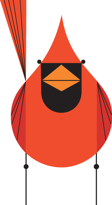
You reflect well on the work of others offering up honest and observant comments
on the work. You are also able to reflect on your own images, relating to the brief
and audience. Although you mentioned you weren’t sure how to respond to the
assignment brief initially you have done a great job at somehow condensing lots of
information into a single image. This is not busy or overwhelming but
communicates your ideas in a subtle yet clear way. Well done, a very positive start!

Thank you, sometimes I find getting started the hardest part. I wanted to create something that expressed me and my interests whilst still being a ‘nice’ image and nothing cliche. 

Project: The History of Illustration
The first exercise explored how illustration has evolved over the last 50 years by
identifying and exploring the differences between a range of illustrators and
contemporary ones.
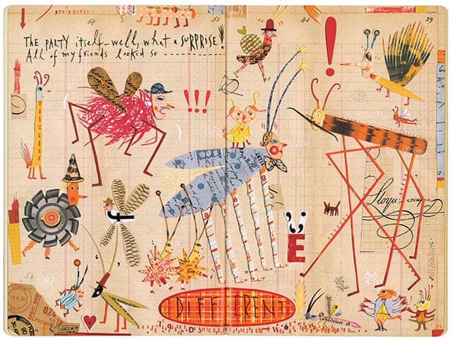
Some good observations of Kathleen Hale’s work as you talk about her imagery
and style and the feel of the drawings themselves. You draw good comparisons
discussing the difference in today’s contemporary illustrations that often rely on
the digital. You relate this to the target audience. It was good to see you cite
similarities between the two artists despite the obvious difference in style.

When thinking of a contemporary artist I knew I wanted to use Gemma Correll as an example due to the subject matter, in this case – cats!

Kathleen Hale Image:Great to see initial sketches and sketchbook pages showing the process you have undergone to get to the final painting. This is very competent and adopts both the colour way and media often used by Hale. It would be interesting to see your typical drawing style alongside this. Good reflection on the process and of course, the comparison to working digitally.

I agree – especially as this is some of the first work of the course – I was so focused on the other artists that I didn’t actually represent myself.

Gemma Correll Image:
Again, great sketchbook work as you perfect the cat drawings and the smaller
details like the eyes and nose. The captions are equally inspired! I think both
images show a clear observation of each artist’s technique and style, which you
have managed to replicate well, offering insight into the experience. A great start.
Good referencing of research and sources.

Thank you! 
Project: The Key is communication
The getting the gist exercise asked you to condense some chosen text into
keywords and then have a go at illustrating them.
This is a clever interpretation of the article, effectively utilising your research. There
is a clear working methodology as you analyse the article, create a mind map and
experiment with visuals research and sketches. Aside form this final idea; did any
others spring to mind? It would be good to perhaps see a few alternatives as well.
It’s clear from the commentary that you’ve used new tools and effects to help
develop your illustrations. These do work well to create the aesthetic you were
after and to tie the whole idea together.
Although the final illustrations do convey the idea some of the visuals on the
clothes themselves could be more apparent. For example, the sea and sand vest – I
initially read it as a cloud in the sky.

I definitely could have explored different ideas more I totally agree. I need to work on developing ideas and exploring techniques more before moving on to the final pieces. I agree about the visuals being more apparent as well – they are definitely quite subtle and could be more obvious.

Feedback on assignment
Assignment one asked you to create a greetings card that introduced yourself and
your work.It’s clear from the commentary you have lots of effective ideas, thinking of ways to combine your interests into one illustration. Clearly there are inspirations behind the ideas such as the ‘lady head’ and ‘gypsy head’ tattoo designs. Perhaps adding more research like this to the blog would help to show how these correlate to your own drawings in Procreate? Just remember to reference it so that sources of text or images are clear (use the Harvard System). Again, a good working method is clear using the mind map and then developing visuals in response to the ideas.
Your drawings skills are good and these are accentuated with the use of Procreate.
It’s interesting to see the development of the digital work too so having the screen
shots really helps as well as adding the digital images to the sketchbook to allow
you to reflect on the work.

Thank you, despite working digitally I do try and use it as if it is just like any other medium where I would reflect throughout and also develop ideas within my sketchbook.

The references in the image, using the tattoos together
with the fabric of the dress work really well. I agree that had you opted for the
items to be within the background this may have made the image too busy and
bitty. As it is, it’s contained and is a clever idea to portray a lot of information
without it feeling overwhelming.
The images on the dress itself are very subtle and so I am assuming that the key or
most important aspects are conveyed through the tattoos that are more
prominent. It’s an effective way to differentiate and add a sort of hierarchy to the
image. However, perhaps the images on the dress could be slightly more apparent
than they are?

Thank you, yes I definitely think they are not as important as the things portrayed by the tattoos. I agree with you about the dress design being more apparent – I will probably go back into the file and up the opacity to create a little more contrast there. I think because I was worried about the image being cluttered I was a little too cautious – it could definitely be bolder.

The nod to different traditional references, such as the hairstyle and
the dagger tattoo, are great and add another layer of depth and interest to the
image. What about the 1950s influence too? Are there key things that stand out for
you such as a particular designer or colours? This can also add to the research to
support your approach. The background pattern could be considered further. Did you try any alternatives? It feels quite different to your main image – do they work
together? Did you also try it without? Compare different versions to see which
would work best. Overall, this is a clever and effective illustration that develops well from the initial sketchbook work.

I agree with the comments on the background – in fact I quite struggle with background because I haven’t actually made a lot of them before. I tried a few different colours and brushes before settling on this one (I should have added more screenshots to the learning log). I think you are right and maybe the background for this doesn’t quite fit – I think I spent so much time on the actual figure that I didn’t give the background enough consideration.

Sketchbooks
Keeping sketchbooks and a learning log is an integral part of this and every other
OCA course, not only because they constitute 20% of your marks if you choose to
have your work formally assessed but they are also an excellent way to document
and reflect on your development.

You describe it as scruffy and a place to think out loud and this is great, it’s what
the sketchbook should be and I can clearly see you use it well to help initiate ideas
and develop these before progressing digitally. As the course progresses you may
want to use it to experiment more with different materials and techniques too.
These can always inform the digital process and would be interesting as a point of
comparison – which you have already touched on in the first exercise. What I also
think is very effective is printing out some of the images from Procreate to add to
the sketchbook as part of the process and to help you step back and reflect on the
work.

Thank you – as I say I just try and use procreate as I would any other medium – I still need a physical sketchbook to ‘think out loud’ other wise I would be stumped. I’m glad that it is okay, I think as long as the mess is contained in there it helps me create a more refined image in the end.

Learning Logs or Blogs / Critical essays
There is good critical commentary on the blog in both the exercises, where you
discuss and compare the two selected illustrators and of course, in your
assignment. You are able to reflect on the work and cast a critical eye over it in
order to develop and refine the image. For the final assignment work consider
pulling in some additional research to support some of your comments and
inspirations for the final illustration.

I agree with the research and will definitely try and incorporate more artist research as I go through the next part of illustration one. Thank you for the feedback, I will be definitely be referring back to it as I go on.