I chose the word extraordinary for this exercise. I was trying to choose a prompt to push me out of my comfort zone and this one certainly did. I started by looking up the definition of extraordinary and synonyms for the word to help me get a better understanding.
This led me to the idea of of a super hero. They are characters that are usually human but possess powers, therefore fitting the definition.


I started by looking through some of my husbands comic books for idea, I looked through a variety of different ones but I did found I liked the style of the older 1980’s comics I was looking through. All these characters are extraordinary in their own ways, some of them have superhuman powers and all of them put themselves at risk to help others.
I moved into working in my sketchbook, I looked online for superheroes and was trying to find away I could fit this into the brief in a successful way. I ended up looking over photographs of batman and the bat signal – which is a large light projected into the sky to let batman know he is needed. I thought this was interesting and could create a successful image for this exercise due to the contrasts between the light and dark.


I made some sketches exploring different ideas for how I could interpret this idea. I ended up deciding on a city view with a beam of light and the silhouette of a superhero in the light. I added two rows of buildings to try and give the illustration a little more perspective. After making these images I made a final line drawing.


I used a Studio Pen in procreate for the final sketch and then inverted the image so I had both a black and white copy. I planned to keep all the windows white as well as the beam of light. In the beam I wanted to add some black lines by using the cut out from the black sheet.


I printed both of these out in a3, the print job wasn’t quite even on the black sheet but the printer tried it’s best! I started cutting out the black sheet to layer on the white sheet. To be honest I was a little dubious at first, I had an idea in my head but wasn’t sure how it would play out. I was pleasantly surprised however with how the image was coming together! The contrasting areas of light and dark did bring some dimension to what was previously a very flat image.


Even though I chose extraordinary as my word I did end up drawing buildings as well, but it made sense for the image.


When I was placing the black layer on top of the white I initally went to glue the windows right over on another so they would sit the same on each layer – I realised however that if I moved them to a slight angle the line art underneath would show through and create a three dimensional effect! I was really happy with this effect and I added it to the rest of the image – I know that the brief says to not let any line art show and maybe I experimented a little too much here.

I am happy with the overall effect however now when I look back over it I wish I had cut out some star shapes from the black sky before sticking it down. I think that it would have been really effective and added a little more atmosphere. If I were to do it again I would definitely use a cutting board and a paper cutting knife! I used scissors for this and it was very difficult to be accurate.
When comparing the finished image with the original line drawing there is a very large difference. The original image is flat and the contrasting layers definitely creates a lot more dimension.
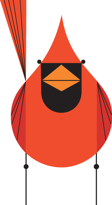
When looking at illustrators who work in a graphic style I came across the work of Charley Harper.

Charley Harper (1922-2007) –Image Source
Charley Harper’s work is very graphic in style – no outlines and block colour. After completing the using black and white exercise when I look at his work I can almost piece it together in the same way. His images are very stylised but still very beautiful. He used bold colours and high contrast to create the animals often featured in his work.
Charley Harper (1922-2007) – Image Source
Harper referred to his work as ‘minimal realism’ which I think is very fitting, the creatures seem almost abstract but they are still instantly recognisable. I wonder if this is because we all find these animals recognisable already so it gave him room to explore shapes and colours whilst still creating an image that a large audience could enjoy. There is so much to learn from looking at his paintings – they are complex but still have an element of simplicity.
