Assignment One; Say Hello – Pt.2

I started work on the final drawing by taking the initial sketch I made on procreate and refining it. I added some of the things listed on my mind map in a design on the skirt, cameras, cups and pencils representing photography, coffee and illustration. I drew a Nintendo switch in her hand (using my own as reference). 

The above image shows my initial line art – I tried out another textured brush to try and make the illustration seem more tattoo-like however it looked blotchy and unrefined. I decided to work with the studio pen instead – which is a smoother more precise brush. I’m glad I did this because other wise I would have lost so much detail.

I took these screen caps to illustrate how I shaded the hair (I also used the same method for the skin and blush). To start I filled in the hair black and then drew big spaces of white on another layer on top. I then use a Gaussian blur to blend the white out, and an eraser to clean up what has blurred out of the lines. I then altered the opacity a little to blend it in before making a new layer. On the new layer I select the studio pen and draw the long black lines that indicate the direction of the hair. This was the main tattoo inspired feature (besides the actual tattoos) and was inspired by traditional tattoos – particularly the ‘lady head’ and ‘gypsy head’ tattoo designs. 

In the images about I am showing how I redrew the eyes. As the drawing was progressing I was more and more unhappy with how the eyes were looking. She looked far too unimpressed/judgy for a greetings card! I gave her a softer expression and also lowered the angle of the eyebrows. I think this helped the drawing a lot, she looks far more friendly. I also added my nose piercing in at this point! The green background was a layer underneath that helps me see any areas that need erasing. I decided on a pink dress because not only do I love pink and have a lot of pink clothes, one of my favourite colour combinations is pink and red. I already knew the tattoos would be the same colour as the lipstick (traditional tattoo’s feature a lot of red) – so I knew I wanted to get some pink in there. 

This is the point I realised the top of the dress looked too empty – after I had filled in the tattoos and lined the dress pattern it just looked so bland. I played around with a couple of ideas before settling on this peter pan style collar and buttons. I used a very light blue to shade in the details to match the blue/green of the switch. I am really glad I did this as I think it helps tie everything together. Before the switch was the only part of the drawing with these colours. At this point I had also added some text in the top left corner just as an example – I was trying to keep in mind that this way a greetings card as I was working. I needed to think about the greeting and text placement.

img_2101

I decided on the phrase ‘Just Wanted to say Hello’ as my greeting on the card. I looked through some traditional greeting cards and one that were just to say ‘hello’. I liked this one because it does feel like the character is introducing herself. I’m also very glad I didn’t go with the idea of placing all my hobbies around me as it would have become cluttered and it wouldn’t have been a clear greeting. This way everything is tied into the character – the more time to take to look the more you learn about me. I was also still playing around the fonts at this stage. After trying a few I thought I had decided on this comic book style font. I did end up changing my mind, it did feel unrefined and a little bit tacky. This is when I also finished the tattoos on the arm so I will explain what they are and what they mean.

The Rose and ‘2016’;
Rose is my daughters middle name and she was born in 2016 – this  tattoo represents her. Being a mum is such a big part of my life I wanted to reference it without it being the focus of the image – this is to introduce me after all!  

Heart;

The Heart is a play on the traditional ‘MOM’ tattoo, it represents family.

Dagger:
The Dagger is there to represent my love of horror and true crime. The design of the dagger is also a nod to traditional tattooing – this type of design (made to look like it is going through the skin) is prevalent in traditional and neo-traditional tattoos.

Paw Prints;
There are two paw prints to represent my two dogs!

Stars;

There is one star to represent each year me and my husband have been together – 8 in total.


Final Piece

img_2087

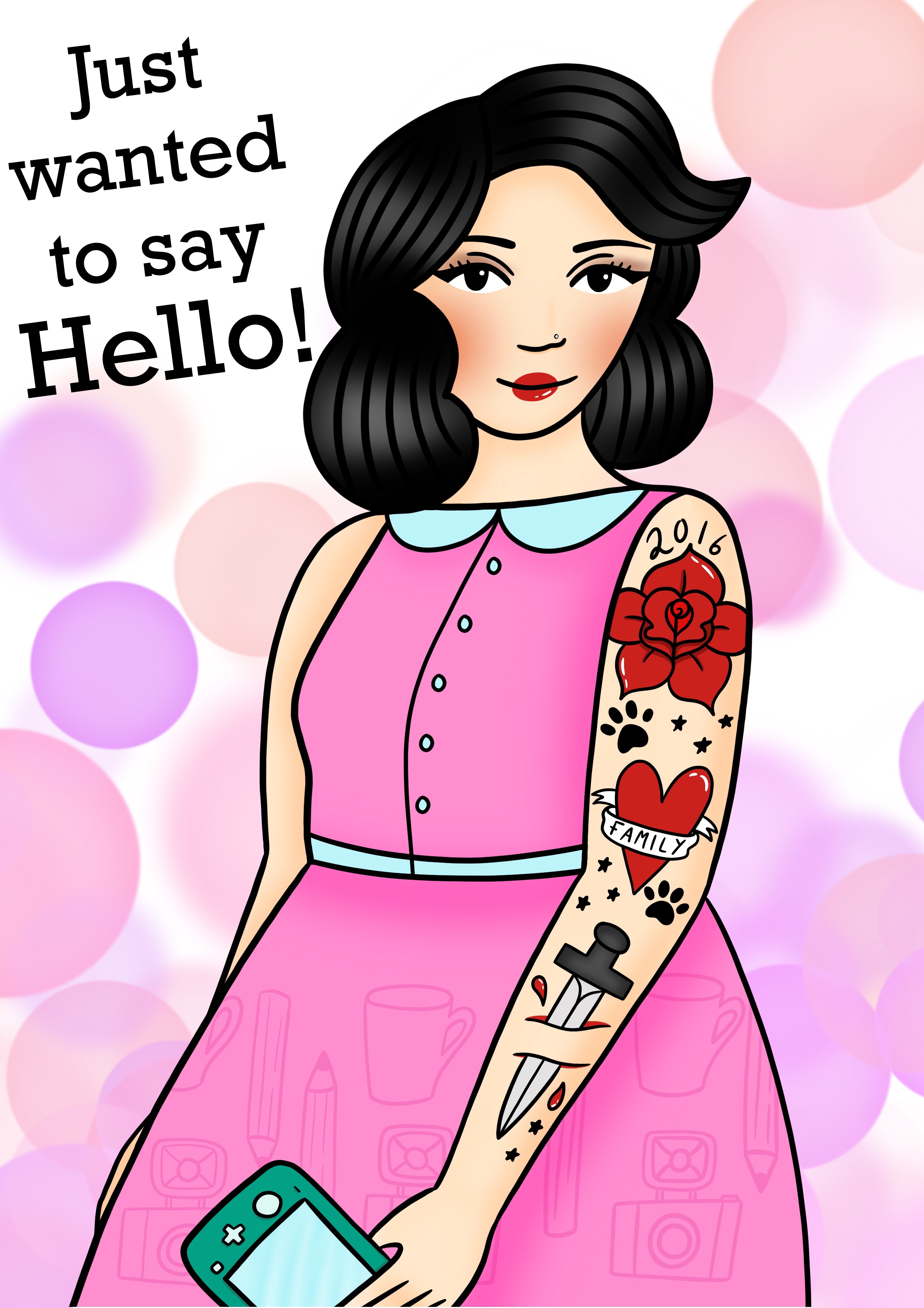
Here is the finished piece. I ended up using a cleaner more modern font, as the illustration is already quite ‘cartoon-y’ I didn’t want it to look unprofessional. I prefer the font, it is clear and definitley makes the illustration look more refined. For the background I actually used a preset procreate brush called ‘Bokeh’ – it is supposed to be used to create the effect of bokeh lights but I think using it in a light colour on a white background created a confetti effect. I used the same colour as the dress.

Over all I am very happy with the way my greetings card turned out. I think if I had spent a little more time on the planning it could have helped me be a little more time efficient, especially when I had to redraw the top of the dress and add more tattoos. That being said I am still happy with the way it turned out and I did stick to my original plan. I’m surprised how tricky it was to try and draw something based on myself actually! How do you try and represent yourself in a greetings card? I have really enjoyed working on this assignment and I’m glad that I chose to work on Procreate. It definitely gave me the ability to experiment and to make changes in ways I wouldn’t have been able to do with a traditional media (changing the eyes for example). 

20200130_214544.jpg

Here is my card printed. I really need a printer for my illustration work because mine did not like printing this at all! I am looking forward to getting stuck into to Illustration One after part one. I have bought a personal sketchbook as well as the one I use for coursework to keep me sketching and practising. I am also planning some gallery visits as part of my research for the course. 

Assignment One; Say Hello – Pt.1

When I read this brief I didn’t really know where to start! How do you introduce yourself with an illustration… To get started I made a mind map as I found it really helpful in the last exercise. I listed all my hobbies and interests and some things about my life.

IMG_20200128_223501.jpg

I love vintage and retro. I dress in vintage style clothing and style my hair in a 1950’s way – I even wear cat eye glasses. I always wear eyeliner and red lipstick. I knew my love of vintage needed to feature in the illustration.I knew that the best way to show this is to make an illustration of myself. 

I am also a wife and a mother of one. As a mum (my daughter has ASD so sleep isn’t always guaranteed) I always have a coffee with me. It’s not the healthiest thing but we all have our vices!
I love video games, I always have and always will. At the moment I play the most on my Nintendo switch. I also love comics and manga – I particularly enjoy horror manga and the work of Junji Ito – I even have a tattoo of one of his characters. This leads us to the next thing – I love tattoos and I have a lot of them! 

IMG_20200128_223511.jpg

Here I made a quick sketch and came up with some ideas. When I was drawing the skirt I thought about making the print of my skirt a pattern with drawings of some of my interests rather than a floral design. This was inspired by the previous exercise where I drew the environmental images on the clothing. 

My sketch book is a little scruffy, but I use it as a space to think ‘out loud’ and figure out my ideas. Working in this way also allows me to refine my ideas and therefore my main pieces. I have seen some people’s sketch books that look tidy and very presentable – so I hope that mine is okay!

On the pages below I worked on some different thumbnail ideas. The first was an illustration of me with drawings of things I am interested in surrounding me – including tattoo designs, a phone with a podcast, a comic book and a games console. I decided against this one since it was a little too cliche. I wanted to come up with something a little more creative than this. The next idea was an image of me and my dog, and in the background some stacked books. The book titles would have been names of my hobbies or books/comics that I like. Again, this idea just seemed too forced. The brief is for a greetings card, I don’t want the illustration to be too cluttered.

The one thing I was sure I wanted to do was an illustration of me, wearing vintage style clothes and hair. The print of the clothes would be illustrations based on my interests. This got me thinking – I could do the same with the tattoos in the illustration. Instead of drawing my real life tattoos, make them tattoos that tell you about me. My tattoos in real life are mostly black and grey realism so it doesn’t really match my style of illustration!

I also wanted to mimic a sort of tattoo style within the drawing – I don’t want to make the whole drawing a tattoo design – I just wanted to add a couple of features. Vintage style and tattoos go together so I thought I would add a couple of elements from the traditional tattoo style. I want to use a bold black outline, and mimic the way the vintage hair is shown in the traditional lady’s head tattoos, with shading and lines. This is what led to the sketches on the bottom of the right page – the quick sketch showing how I intend to shade the hair and some tattoo designs. The purple sketch is printed from procreate, I made the sketch based on the thumbnail at the top of the page. I decided this was the idea I wanted to go with – so started working based around that sketch. 

Assignment One; Say Hello – Pt.2

Writing A Brief

Olimpia Zagnoli for Barilla – Image Source 1

I originally came across the work of Olimpia Zagnoli by listening to the podcast ‘creative pep talk’ in which the host Andy J. Pizza (another illustrator and graphic designer) discusses her work. I looked her up and found her work instantly recognisable – I just knew I had seen some of these before! And there is no wonder I found Zagnoli’s work recognisable, it has been on the pages of major magazine and newspapers and adorning advertisements and fashion brands world wide. Besides the beautiful aesthetics and colours, the thing that really got me gripped was the story of Zagnoli’s work for Italian pasta manufacturer ‘Barilla’. Long story short, Barilla were a homophobic company who had previous spoken out against having gay couples represented in their advertisement – in an act of protest Zagnoli created work for them that featured a female couple holding hands and sharing spaghetti. Barilla ended up using the work in their campaigns and on packaging! I will leave a link here to an interview where Zagnoli tells the story, it is worth a read. It does show how much the illustrator and designer can actually influence.

Olimpia Zagnoli for Barilla – Image Source

We are looking for a contemporary illustration in your signature style for the pasta manufacturing company Barilla.

  • The client is looking for an illustration to use in advertising campaigns as well as to adorn their packaging. Barilla’s packaging is consistent and our brand is instantly recognisable. Barilla’s packaging is typically blue showing their logo, a white and red ellipse with the company name in the centre. The client would like to keep with these colours.
  • We would like the illustration to feature a couple or a family and incorporate pasta into the design somewhere – whether it be a repeat pattern or people enjoying pasta.
  • We are looking for a contemporary illustration to update the image of the company. We would like to update stylistically with more contemporary packaging and also by representing more diverse groups that we haven’t represented before.
  • We would like the art work to appeal to both our existing customers but also to attract new customers. We would like to appeal to a younger market, and attract more millennial customers and we need to understand that we need to be more inclusive as a brand in order to do this.
  • The illustration will be used on both advertisements and on our pasta packaging. This means that the image will need to be high resolution, as it will need to be used on our boxes but also be able to be resized to fit magazine and newspaper advertisements.


Part One, Exercise Two; Getting the Gist

For this Exercise I decided on this article – ‘Why I’m Mugging Off Love Island’s Fast Fashion’  – It was actually in my Google news feed. I have recently been reading a lot of articles and watching documentaries on the effects of fast fashion and our throwaway culture. A lot of these stories are based on US consumption so when I saw this article pop up from the metro of course I clicked.

3083368_loveisland_0 Love Island Clothing Advertisement – Image Source

I am not a watcher of reality TV so this was a real eye opener to me. The reality TV show ‘Love Island’ has partnered up with a brand called ‘I Saw It First’. The brand supplies the TV show with outfits – and then sells the same ones on it’s website for viewers to buy. Newspapers, websites and social media stars (including the contestants) then promote these cheap clothes. It is sold as a lifestyle – If you wear this, you’ll be like me!

Love Island Contestants with adverts for their outfits
Image Source 1Image Source 2

However these pieces are all of typical fast fashion quality – cheap to buy, poorly made. designed to be worn once and never again in most situations. The materials are artificial, and despite me spending some time on their website – I can’t find anything about their manufacturers or ethics –  which speaks volumes! Because these clothes are not made to last, many of them end up in landfill and fashion is one of the worlds largest polluters.

“To cut a long story short, buying clothes at the rate we do (the UK purchases two tonnes of clothes per minute) is massively fuelling climate change.” – Tori Keene – Metro

I made a mind map around the topic of fast fashion, re-reading the article and choosing words that relate to the phrase – including what fast fashion is and the problems it causes.
I then re-read the article and listed all the words that stood out to me. I then re-read those words and underlined all the ones I found most important. The thing that really stood out to me when writing these words and re-reading them is really the juxtaposition of the two prevalent themes – Fashion and Environment. It really seems like a Fashion vs. Environment situation and the environment is definitely losing – and it seems like the customer bases of the websites do not care or don’t even know!

Image Source 1Image Source 2Image Source 3

When thinking about what I wanted to draw for this exercise I kept in mind that these need to be illustrations to accompany the article, I wanted to keep it simple but effective. I started by referring back to the fast fashion website that sells the clothes discussed in the article. I knew that I wanted to represent the Fashion vs. Environment theme, something to make the reader think – ‘Oh, is it really worth it?’. When I was on the website I found it so incredibly ironic that a lot of the designs feature floral and animal prints, when the production of the clothes is so harmful and the disposal of the clothes is almost impossible.
I started sketching some of the clothes in procreate and then added them to my sketchbook where I could think. I chose the clothing above because it had elements I could tie in with the environment theme – the sandy coloured dress, the blue co ord could represent water or sky. I also chose the silver bikini because to me it really encapsulates everything fast fashion in one image – overly edited body, garish, cheaply made, plastic and impractical. I decided to do it in grey rather than try and depict silver because I want to display that more natural environmental look.

When explaining my work for this project I thought it would be best to screenshot the image as I worked (please note I am working on an iPad, with the Procreate software and an Apple Pencil). Working digitally on procreate has been my favourite method for the past year – however I am still learning all the time as my experience with digital art before that was minimal.

I planned out each image in my sketchbook first however I did allow myself to alter the drawings as I went if I had an idea that I preferred. I used the initial sketches I made and then on other layers I started building the image up. I used a watercolour brush to give a more natural look. For the outline, I decided to use a brush that looks like a dry ink – I think both of these brushes make the image appear organic. I then started drawing a world map onto the skirt on another layer (using a reference image from google). This took me way longer than I would like to admit! After drawing the map I moved areas around – Some on the top and some on the skirt. Although this is the way I originally planned it in my sketchbook, I was unsure because it makes the map so inaccurate – however it does make the drawing more pleasing – it definitely seems more like a print you would find on this website.
The inspiration behind this piece is a globe – prompting viewers to think about the bigger picture when they look at the garment. I am happy with the way it turned out, I have never tried using a more ‘sketchy’ brush for outlining before, but now I definitely want to explore/experiment with more textures and effects!

I worked in the same way for each of the drawings, taking the initial sketch and building up on layers on top of that. I actually refined the sketch for this one to clean it up – obviously it needed doing but now I look back I do feel like I have lost some of the movement of the fabric. For the sandy coloured dress I made a drawing inspired by the ocean, this dress represents the sea and sand. It looks like nice clean water and sand, much the opposite of the places these garments will end up. I played around building up different layers of blue and white and blending them to create the effect of waves. To give the ‘sand’ a little more texture I added a spray paint effect in the same colour as the line art in a low opacity. I toyed around with changing the outline colour to blue, as it matches the bottom of the dress, but I just thought the brown worked better. It helped create a consistent ‘organic’ feeling that matches the first drawing. The first drawing was also blue so I wanted it to be different – I think they are still coherent though. They would look at home illustrating the same article.

For the third and final piece for this exercise I focused on a sky and clouds design. When I decided on grey for this piece I knew I had to do those beautiful British grey skies – I did actually make it a little bluer than I originally intended as I wanted it to represent beautiful parts of nature like the clouds/sky but the darker grey made it seem smoggy. I wanted this series to be sort of a trade off – our natural scenes vs your clothing however it would also be interesting to do a series where I look at the after effects of this showing the scenes of damage. It would definitely be more shocking – but I think the ones I have drawn are more appropriate for the article I am looking at. To create the clouds I did use a special effect brush that already gave the appearance of clouds, I drew the shapes and blended different colours to get the effect I was looking for.

Finished Images

img_2080img_2079img_2078

I am happy with the way these images turned out. I don’t think they would look out of place alongside an article based on fast fashion and I think they go well with my chosen article as I drew clothing from the actual website/tv show being discussed. I also enjoyed working with the more organic brushes on procreate – they look like hand drawn pieces even though they are 100% digital – this is something I will definitely come back and explore in later exercises.


Part One, Exercise One; The History of Illustration

Kathleen Hale

Kathleen Hale (1898 – 2000) was a British Illustrator and Author. She was and still is best known for her children’s books ‘Orlando, The Marmalade Cat’.

Image result for orlando the marmalade cat"
Orlando The Marmalade Cat – Kathleen Hale – Image Source

When looking through the suggested illustrators for this exercise I was so drawn in by her distinct style and lovely bright and bold colours. I think they also drew me in because they do remind me of the children’s book’s I used to read as a child. Even though I was a child in the 1990’s a lot of the children’s books I would read were often from years before particularly 1930’s reprints and illustrated books from the 1970’s – we bought our books from charity shops and of course my Mum would have recommendations from her childhood too. I wonder if it is the sense of nostalgia that made me fall for Hale’s illustrations. There is something interesting in the way she drew and painted her characters – the cats bodies almost remind me of paintings of Chinese dragons. Their bodies curve and seem quite grand, I suppose that is a good way to illustrate a cats movement in a still image.

Image result for kathleen hale orlandoKathleen Hale – Image Source

The brief asks – Did the work of the illustrator that you chose from the list seem old fashioned?  Of course my answer to that is yes.
Did it make it less enjoyable to me? No in fact I think the age of the illustration adds charm for me – these illustrations were made before digital illustration exisited. She wrote and drew everything be herself – and as a woman in the early to mid 1900s – I find it completely inspiring!
Now that is my personal opinion, what about her target market? Children today would perhaps not find the illustrations so charming. They are stylised but not particularly ‘cartoon-y’. The colours are bright but children now are used to digital art, where lots of colour and contrast is almost expected. I don’t think my nearly 4 year old would favour these drawings over her modern books – which is quite a shame I think.

I drew some cats in my sketchbook, using Hale’s work as reference before moving onto look at refefrence photographs of cats on Google. I ended up drawing a little cat in the middle of the page, surrounded by a heart ribbon – inspired by hales drawings. I started playing with watercolour and pencils in my sketchbook before moving on and making the final sketch.

I painted the cat using watercolours. I took reference from Hale’s images, using orange and blue and some green for the eyes. Over all I’m quite happy with the way the cats face turned out. I think he looks very cute! This is not anything like my usual drawing method – I do a lot of digital drawings these days so it was nice to work with paint and paper again.

The thing I’m least happy with is the ribbon! I tried to emulate Hale’s style by using an outline and shading it in and it did not work out well. The pen was not compatible with the water colour paper and bled so I tried to shade it out – it ended up looking quite clumsy! I really did miss that ‘undo’ button I’ve got so used to!

Gemma Correll

When I had to choose a contemporary illustrator I decided on Gemma Correll. The reason I chose to look at Correll’s work is that when I think of an illustrator who draws cats – she is the first that comes to mind. Gemma Correll is an illustrator and author who often makes humorous illustrations based on herself, her dogs and cats.

Image result for gemma correll"Gemma Correll – Self Portrait – Image Source

Gemma Correll uses black ink pens, watercolour and alcohol markers to create her illustrations. There is a clear divide in the styles of each artist here despite their subject matter – Correll’s style is definitley more minimal than Hale’s – always using a more limited colour palette and white backgrounds.

Image result for gemma correll cat"
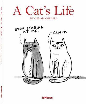
A Cat’s Life – Gemma Correll – Image Source

Despite the differences, both of these illustrators seem to really convey the feline attitude cats are so well known for. Hale’s work shows the movement and the fun side of the cats, where as Correll often depicts the ‘mood’ – that often unimpressed, disapproving stare that cats give.


Sticking to the cat theme through out this post so far, I focused on Correll’s cats as inspiration for my drawings. I sketched out some cats in a similiar style and I practised the faces to see how the eyes effected the looks – some wider and some more narrow. The minimal aspect of these illustrations was quite tricky – there was nothing to ‘hide behind’. I am used to drawing out line art and being able to edit it as I work and shade it!

IMG_20200127_230438.jpg

I ended up on this drawing… Now I am no writer, so clearly mine isn’t as funny as it should be! But I still enjoyed working on it!


Credits – I used the UCA online library and google search to learn about Kathleen Hale.

“Obituary: Kathleen Hale: Illustrator and writer whose feline creation, Orlando the marmalade cat, enchanted generations of children.” Guardian [London, England], 28 Jan. 2000, p. 24. Gale Academic Onefile, https://link-gale-com.ucreative.idm.oclc.org/apps/doc/A75790428/AONE?u=ucca&sid=AONE&xid=a0763d9f. Accessed 20 Jan. 2020.

Kathleen Hale – Wikipedia

Kathleen Hale – BBC Radio 4, Desert Island Discs