This part of the course explores on the process of transforming your ideas into a
form that best communicates them.
Overall your response to part three has been very good. Initially there is a thorough
and honest response to the previous feedback as you work through this and
summarise key points to take forward for this section. This is evident in the work.
You’ve also responded to the research suggestions and discuss these readily in one
of your posts.
Your responses are always thorough and it’s great to see you return to work to help
improve and refine it. The final assignment work is good and responds to your
research and analysis of this. However, at times I feel it would’ve been good to have
seen more influence from the exercises here as well to allow you to push the work
a bit further in terms of mark-making and composition. You’re very attentive to
your own process and how you can develop this to improve the use of type and
image. It’ll be interesting to see the progress for the next section.
Thank you, I try and be as constructive as possible when looking back over my work. I definitely want to change somethings after looking back over part 3 alongside your feedback!
Overall Comments
Project: Composition and viewpoint
Your first exercise explored visual space by using a tree, child and a building to
create a series of images.
There are some varied responses to this task; you could even consider more
extremes of scale too, so taking the images even smaller or bigger. You critique this
work well and consider how the images vary and communicate.
Project: Hierarchy in the image
You were asked to carefully read an image and identify its message, narrative and
visual hierarchy.
You respond well to this and effectively interpret the image by answering each of
the questions. Aside from this you also consider how the task has been useful and
what you can then apply to your own ideas and process.
2Project: Visual properties
The image development exercise encouraged you to identify visual spaces by
cropping an image, and using the results as a basis for a poster.
What sort of key themes or words did you consider in relation to your cropped
images? It would be interesting to know what you thought they conveyed after
being cropped. I think your final image responds well to the task and some of your
earlier commentary. The final illustration is great and relates clearly to your original
image and your intuitive feelings about it. It’s great to see you act on some of your
suggestions from part two and to start experimenting further with media, here
collage. The mix of hand drawn, collage and digital finishing works very well to
create an authentic and professional image. I agree maybe additional
experimentation with type may find an alternative result but as it is, it’s fine. It
presents a calm feel to the piece.
Thank you – I am enjoying combining both traditional and digital, I would like to try and achieve a seamless balance between the two with time.
Project: Abstract illustration
Having listened to a piece of music you were asked to respond visually.
This is a great response. I thought it positive you naturally anted to work on a larger
scale to allow movement into the image but like you said, you’ve managed to
achieve this at a smaller scale. It’s good you refrained from listening to the piece
beforehand to allow for a more authentic response. It does work well and your final
image together with the typefaces conveys a very convincing aesthetic. You clearly
give a lot of thought to type and image and although this isn’t something you’ve
done before, hopefully you’ve learnt something that you can potentially apply to
future briefs or even utilise within your own more figurative responses.
Thank you! I really need to step out of my comfort zone and allow myself to be more experimental. I do feel like the coursework is pushing me in the right direction.
Project: Diagrammatic illustration
You were asked to visually give instructions for a choice of tasks.
You’ve been so meticulous about this work and persevered to try and resolve it. I
agree with your original analysis and that although the images and type are well
drawn they require a little more arrangement on the page. For this, consider scale
(as in the first exercise) to help place emphasis on certain aspects of the process.
This will also help the image to look more dynamic as the scale may shift and the
white space occupy less of the page. As most of your images are set at an angle
consider trying the type set horizontally as well. As everything is offset it becomes
a little overwhelming. Consider looking at some illustrators that create their own
type to help with this in future. Look at Alice Tait, Marion Deuchars and Nina
Chakrabarti for inspiration! The first illustration would’ve worked if you had
considered adding emphasis (e.g., scale or weight) to some of the words and
moving some of the images slightly (e.g. kettle pouring into cup brought down
and left, set at more of an angle to the left and the milk carton brought left slightly
and turned towards the right. Try to think of how the eye might travel, left to right
and down through the images and instructions.
Thank you, although there are still some issues with this piece I am glad I revisited it. I agree – I should have taken in to consideration how the piece would be viewed and how the eye would travel.
Project: Visuals
3 These exercises focused on presenting your ideas to potential clients by reducing
two illustrations down into simple client visuals, and reflecting on your choices of
viewpoints from photographs that captured a range of themes.
Viewpoint:
I think you’ve done really well with this task and have got the gist of it. I agree with
your reflection on the work though. Perhaps tone or mark making would also allow
you to convey more about the image. It’s great to see a thorough process from
initial compositions to reworking the images again after using a viewfinder. The
versions created in procreate are good. As you say, the first is successful as the
spanner is obvious and allows the audience to create associations. The second
image is a bit more obscure.
Client Visuals:
These are good and I can see the breakdown of the image clearly as you have
pared it back more and more. I agree the second from last version is the most
appropriate, as it is, with minimal detailing. It’s interesting to read your
commentary on this task and indeed many of the tasks throughout this section.
I’m glad that the commentary is interesting – I do wonder sometimes if I am a bit ‘too much’ with the blog posts but I do find it helpful to go back over the notes I make to myself.
Project: Creating mock-ups
You were asked to create a mock-up for a book cover.
I agree you could’ve explored the initial ideas further, rather than being swayed by
the original cover. Sometimes it is difficult to subconsciously forget these images
and they return in our own work but perhaps exploring more of the theme of the
book, the main character, traits, mood etc. All these would open up new ideas and
ways to progress the work beyond the obvious. The mood board could also focus
on the mood or atmosphere created by colours and textures as well as the figures.
E.g. red for danger, colour palette in the film (sometimes they can have a particular
palette).
I think the textured brushes in the background provide a good atmosphere of
sorts, I was wondering if you could use these to create the figure or dragon as
opposed to solid colours? Or cut away the images from the background to leave a
suggestion of an image. How would this work? It may be good for you to think
back to the abstract illustration exercise and what this entailed. Can you do
something similar here? Also using a viewfinder on the image you do have would
be interesting too. Abstract different areas e.g. her hair, ear and dragons jaw works
quite well. At the moment though, it doesn’t quite have the right feel. Look at
other covers as well to get some inspiration? The decorative font is perhaps too
decorative? Try others to see what happens. In many ways I feel like you could
simplify this visual to make it more effective. Consider just the tonal range of the
brushes texture and the outline. Invert it too to see what effect this has, even on
the brushes. Once you have all the elements you can also move them easily around
the page to perfect the composition further. I did wonder if the dragon image4should be smaller to balance out the figure, as at the moment they are both the
same sort of scale?
I agree with everything you say here – I am certainly considering revisiting this exercise before heading for assessment. I was initially wondering whether to restart the piece all together but I feel reassured after reading the positives here. I do agree that the scale should probably be altered – I will play with the composition as you suggest.
Assessment potential
Select one of the statements below / delete as appropriate
I understand your aim is to go for the Visual Communications / Creative Arts Degree and that you plan to submit your work for assessment at the end of this course. From the work you have shown in this assignment, and providing you commit yourself to the course, I suggest that you are likely to be successful in the assessment.
Feedback on assignment
Creative and analytical thinking, Visual and Technical Skills
Assignment three asked you to transform your ideas into a form that best
communicates them by designing a poster for an Early Music concert, a Jazz
evening or for a pop group.
There is great research to kick-start this assignment. You comment on this well and
express why you like it, how it is effective. It’s clear you’ve taken inspiration from
the styles you have found, in particular the use of bold colours and simplified
images.
You’ve created a lot of figurative responses, inspired by this research. Although
you’ve opted for the figure as the main illustration also think about mark making
too and responding in this way to perhaps help create the background? The
painterly effect is just about apparent. If you think back to the Abstract image
exercise this did manage to retain a lot of energy through your intuitive response.
Can you do something similar here?
All the elements for this are good but I feel that perhaps referring back to some of
the previous experiences in this section, in particular viewpoint, abstract
illustration would really help to evolve it further. It’s on the right track but I feel has
the potential to develop further! The composition works well but again, don’t feel
you can’t experiment with this as well by using a viewfinder and moving it around
the composition. As it is, with the figure cropped by the page, this works well. But
again, seeing some further experiments would be good and could open up more
possibilities for the image and type. Although the figure is minimal consider trying
this in the silhouette form too, and playing around with inverting the image. The
use of the offset letters for ‘JAZZ’, work well, making the design more dynamic and
playful. However, the letter “J” is set too far left next to the page edge so adjust the
kerning (space between individual letters) to bring this in closer to the ‘A’ so it
retains the same spacing as the rest of the word.
I think it’s very positive to read your final reflection and that this work was a
departure from the norm and this section has seen you embrace the experimental
and become more accustomed to making mistakes. This can be hard at first but it is
a very important part of the process, and without it the work won’t progress and you won’t gain the insight you need. Keep an open mind about this and don’t be
afraid to make the mistakes. Keep it up.
Overall, this is a good piece of work. You are methodical and engage with the
subject research readily using this to create your own ideas and to develop these in
the sketchbook before creating digitally. One thing that was apparent was that you
could refer back to some of the exercises in this section (as mentioned) to help
inform this final assignment work further. Somehow the final image feels much
more static than say the abstract image experiment. Could this have been a useful
process for this assignment? Even with good effects digital software doesn’t
manage to achieve the same level of energy and spontaneity as the traditional
processes, possibly because it’s a less physical process. What do you think?
Thank you for the feed back here – I will 100% be revisiting this piece. The kerning on the lettering annoys me every time I look back over it – If I do use digital text again I will be sure to use software that is better suited to it (such as photoshop). I would really like the piece to be more expressive and less flat – I don’t think that the final image communicates the energy I was hoping to portray in a piece inspired by jazz. I completely agree with what you say about it being less of a physical process – I also think by working traditionally I could work at a larger scale that would allow for more freedom.
Sketchbooks
Research and idea development, Context
Great sketchbooks, you use these well throughout the process and have clearly
been willing to experiment further with different, more hands on techniques like
collage. Use it to experiment more with images for the final assignment too.
Learning Logs or Blogs / Critical essays
Research and idea development, Context
You respond well to research and use this to form some valid responses to the
brief. You can discuss the work well using your own ideas and thoughts. Good to
see you also respond to research suggestions form the last assignment. You are
able to reflect on the work throughout the process and often this allows you to
return to work or re-evaluate it based on the brief and your own intentions. It’s
good to see this level of motivation and persistence if you aren’t happy with a
piece. You summarise the exercises and assignment well and I agree with all of
your suggestions for ways to progress the work. You have also acted on your own
reflection from part two by managing to utilise more techniques in your work and
being open to making mistakes.
Suggested viewing/reading
Aude Van Ryn
Shonagh Rae
Simon Pemberton
Pointers for the next assignment
The next assignment explores the process of transforming your ideas into a form
that best communicates them. This is an opportunity to …
• Try to use the exercises to inform the work for the final assignment. Apply
what you have learnt to explore further creative options in response to the
brief.
• If you’re interested in type, spend some time looking at examples of
illustration work together with the typography. How do the two work
together? Also consider looking at hand written type.
• Your reflection throughout is good and you use this to progress the work
further. Keep this up!
• Have the confidence to continue the experiments with different media (e.g.
such as in the Abstract image exercise).
Tutor name: Laura Scott
Date 11/06/2020
Next assignment due 13/08/2020
Thank you so much for the feedback – I have found it really useful and it has also helped me clarify some of the areas I went wrong. As I look back over part 3 I am happier with it than I initially thought I was but I will take your suggestions and rework a few things with fresh eyes.


 Shonagh Rae –
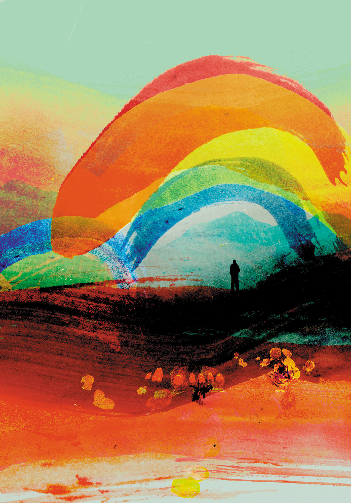


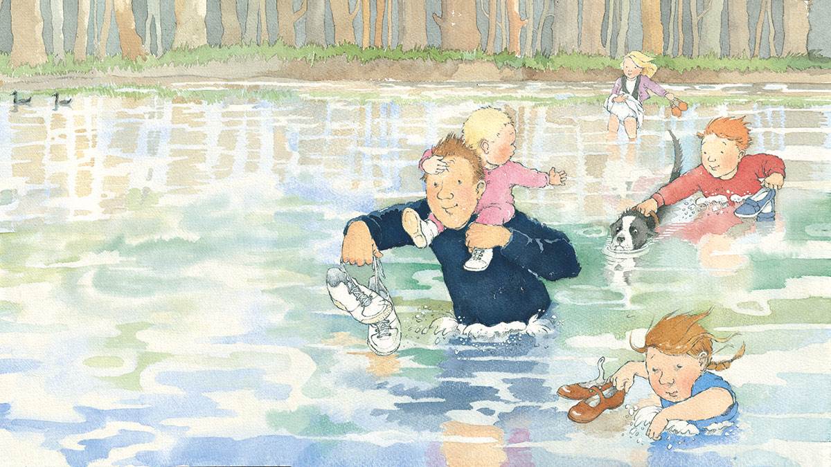
 The Folio Society – Jonny Hannah –


![Milo Manara Art You've Probably Never Seen [30 Pictures]](https://www.heavymetal.com/wp-content/uploads/2020/01/manara-vogue-italia-cover-827x1024.jpg)
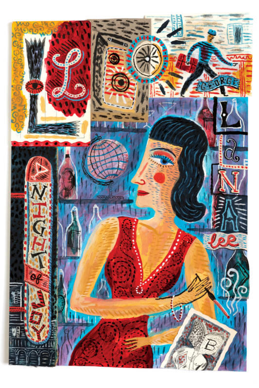
 Blueberry Muffins – Benedicte Caillat –
  Felicita Sala –
  How to Eat Ramen – Nicolau –


