In this post I am going to look at some work by illustrators my tutor has recommended I look at. I had already worked through most of part 3 before receiving my tutor feedback so I will take what I learn forward in to the next part of the course with me.
I think my tutor wanted me to look at the use of line within these illustrations as I have previously mentioned in my own self critique that my use of line/line weight isn’t as effective as it could be in my work. I often use block black line and it stays one weight throughout the drawing.
Orly Orbach

This Little Piggy – Orly Orbach – Image Source
When I look at this piece by Orly Orbach I can see the importance of the line weight – she has used many varying weights and pressures to achieve a more organic image. I can see where she has used thicker lines on the toes/pigs to indicate shadow and it also adds definition when one pig is behind the other. I particularly like the contrast between the areas of the drawing where she had more ink on the brush and where it has become drier whilst drawing.
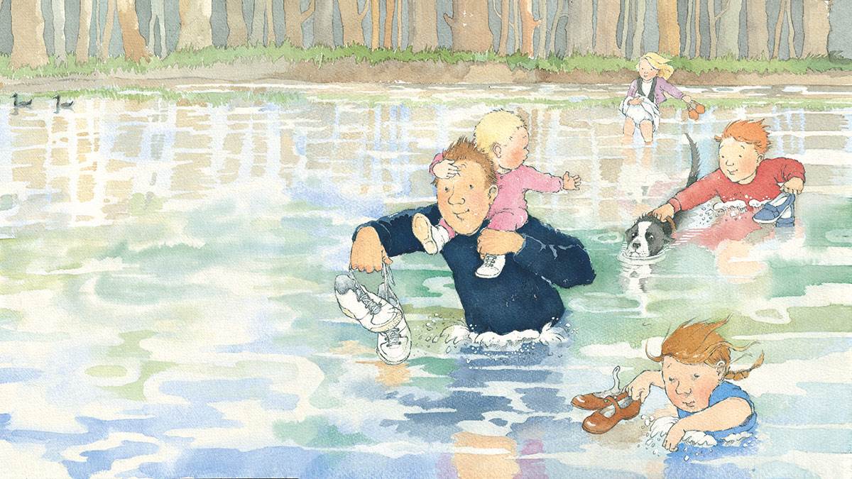
Barbara Firth

Big Bear Put Litle Bear to Bed – Barbara Firth – Image Source
I felt instant nostalgia when I looked up Barbara Firth’s illustrations, I can quite clearly remember reading her books as a child! Her use of line is very effective through out the drawing. She uses directional line to suggest the different textures – you can clearly see and understand the creases in the blankets and the pillows. The texture of the fur on the bears is done in the same way and she used cross hatching to indicate shadow on the fur. I find the use of line to indicate the darkness in the room most interesting however – it is not something I would have ever even thought of doing but it does give that feeling of the darkness/shadows in the room.
Helen Oxenbury
We’re Going on a Bear Hunt – Helen Oxenbury – Image Source
Here in Helen Oxenbury’s work you can see the original lines in the finished piece – she hasn’t redefined a lot of it after the piece was finished but you can see some areas of detail where it has – I think this is very effective especially where you compre the background and the foreground. The background has less detail than the figures in the foreground which creates a sense of distance.
Jonny Hannah The Folio Society – Jonny Hannah – Image Source
It is interesting to look at the work of Jonny Hannah in comparison to the rest I have looked at as he uses line in a completely different way. Although there are some areas in the background that have outlines, most of the use of line is to give detail, texture and to suggest shadow. I have a lot to learn from his work, it feels quite playful compared to how I draw – after looking at these examples and going through part three of illustration one I definitely want to be more playful within my own practice and allow myself more freedom. I used to really enjoy drawing with inks and allowing both myself and the materials to be spontaneous.
As I look forward into part three I know that I want to be more experimental and more confident in my own work. I want to be more spontaneous and experimental in my practice. I definitely have the ideas and want to experiment further but I’m often to anxious to ‘ruin’ something. This will be one of things I look to work on more in the next part of Illustration One – I also plan on experimenting with more media, I have done a lot of digital work in this part and would like to work more with my hands – I have placed an order for some drawing materials and hope they arrive soon, I wish I had planned better before the lockdown!
