For this exercise I chose the book ‘The Girl With The Dragon Tattoo’ – In all honesty I haven’t started this book yet, but it has been in my ‘to read’ pile for a long time! I was hoping to find a little more time to read now we are all in isolation but I somehow feel like I actually have less time than ever now!

I watched the movie of the book, read the blurb and excerpts from the book describing the character on the cover of the book. I also found out that there is a dedicated wikipedia page to the character I was looking at.

I started by making some sketches in my book based off the cover of the book I had, and wrote a list of all of the things about her that came to mind/had been mentioned in the things I had read. These sketches were rough and loose, just to get the feel of the character really. I wasn’t yet sure where I wanted to go with the drawing – I didn’t want to just redraw the cover I was looking at but I did want to take inspiration from it.


I also gathered some photographs for a mood board in my sketchbook from google image searches but I made the discovery that my printer has now broken. I really wasn’t off to a good start on this exercise! I usually like to combine all things in my sketchbook so they are easier to look over (including my digital sketches). We will have to settle for a digital mood board of sorts! Here are the some images I gathered –


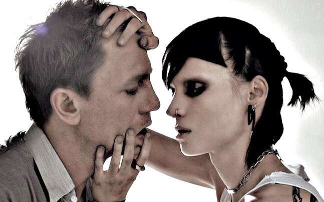
I particularly liked the bottom image of her, I liked the side profile – and I made a sketch based on it in my sketchbook. I liked the element from the cover of the copy of the book I had where the dragon was featured on the cover as though it was its own character.

I decided to take this idea and use it within mine. I think the dragon also added to the mood of the character, she is dangerous and unapologetic – the dragon fit this theme (as well as being in the title of the book of course). I ended up using this sketch as the inspiration for the final piece, looking back I do think I could have explored even further – maybe sketched some more of the images before moving on to the thumbnails.


I took the sketch and put it into procreate and started working on the line art. I kept the outlines bold and black on her face as I wanted her to really stand out – it was also reminiscent of a tattoo itself. I wanted to refine the sketch of the dragon so I looked at some photographs of real dragon tattoos and tattoo designs before coming up with my own. I wanted it to have the feel of a sort of ‘tribal’ style tattoo as I wanted it to be clear to the viewer that it was the dragon tattoo.


I shaded in the line art of both the face and the dragon to look as though they were done in a traditional media – I like the inky watercolour effect but working digitally gave me the freedom to move the drawing around, resize it or alter it if it didn’t work well in context with my thumbnail. I’m glad I did as I did end up having to move things around a little bit when I put things on to the actual book cover layout.


For the background of the piece I layered some textured brushes in black and red to create a ‘grungy’ look. Now when I look back over it I’m not sure that this was the most effective thing for this piece as I do feel like the actual illustration is lost within the background. When I was making it I felt as though the colours were the right choice as they blended in – but now I am looking over it again I can see that this is actually the problem as the illustration quite literally blends in with the background. I chose to use a tattoo inspired font, but I also paired it with a cleaner more readable font. I didn’t want it to be too busy or too difficult to read.

After writing this up I went back to the file and removed the background layer – I think the drawing looks better already. I couldn’t just leave it after noticing, just thinking about it was annoying me! I think with the white background it looks cleaner and more professional. I also created an alternative that has some shadow in the background.

Although I am happier with these pieces do they portray the energy I wanted them to? I’m not sure that they do. The colours and the fonts help – but I do feel like the image should be ‘darker’, in both visuals and theme. That being said I am happy with the illustration itself – the face and the dragon, I like the contrast between the lines and the shading. I think the graphic design element of this exercise was my downfall – I do have a lot to learn when it comes to design! This exercise has definitely helped me think more about things I should consider before starting the final piece and to not be afraid to experiment with more options before beginning the final piece. If I had come up with a few more alternate backgrounds I wouldn’t have had this realisation at the end.
